5 reasons why you should use Anima with Figma3 min read
Reading Time: 4 minutesFigma is one of the best design tools today. If you are a designer reading this, chances are you’re using Figma.
It’s also likely you’ve heard of Anima since you’ve stumbled into this article. Common question designers ask is — “If I’m already using Figma, why would I even need to use Anima?”
This article clarifies which use-cases Anima supports and how you can make your prototypes so good, that your boss and developers will be super impressed. 🤯
1. Responsive Prototypes 🖥📱

Figma design with a frame for Desktop, and a frame for Mobile.
As a designer, one of the things you do is to send prototypes to stakeholders. To your manager, your company CEO, a beta testing user, different people.
Each one has their own device. One opens your prototype from her Desktop, one from his iPhone X. Another from an Android tablet.
What if you could send a single prototype link, that would magically show the correct version of your design, adapted to the visitor screen size.
For that, you would need Anima.
With Anima, you can connect multiple frames as “Breakpoints”. That means that when using an Anima prototype, the correct “Breakpoint” will display, according to the visitor screen size.
Learn more about Breakpoints.
2. Live forms in Prototypes ✍️

Figma design with a live form, by using Anima
Have you ever done a user testing session where you had to say: “Imagine that when you click here you can type your email”.
Or on Mobile, “Imagine that when you tap here, the keyboard pops up”.
Well, if you’d use Anima you no longer have to say that.
With Anima’s live forms feature, you can define any text layer as a live input, and your testers will be able to type things with their keyboard.
You can even use form validation out of the box.
Learn more about Forms.
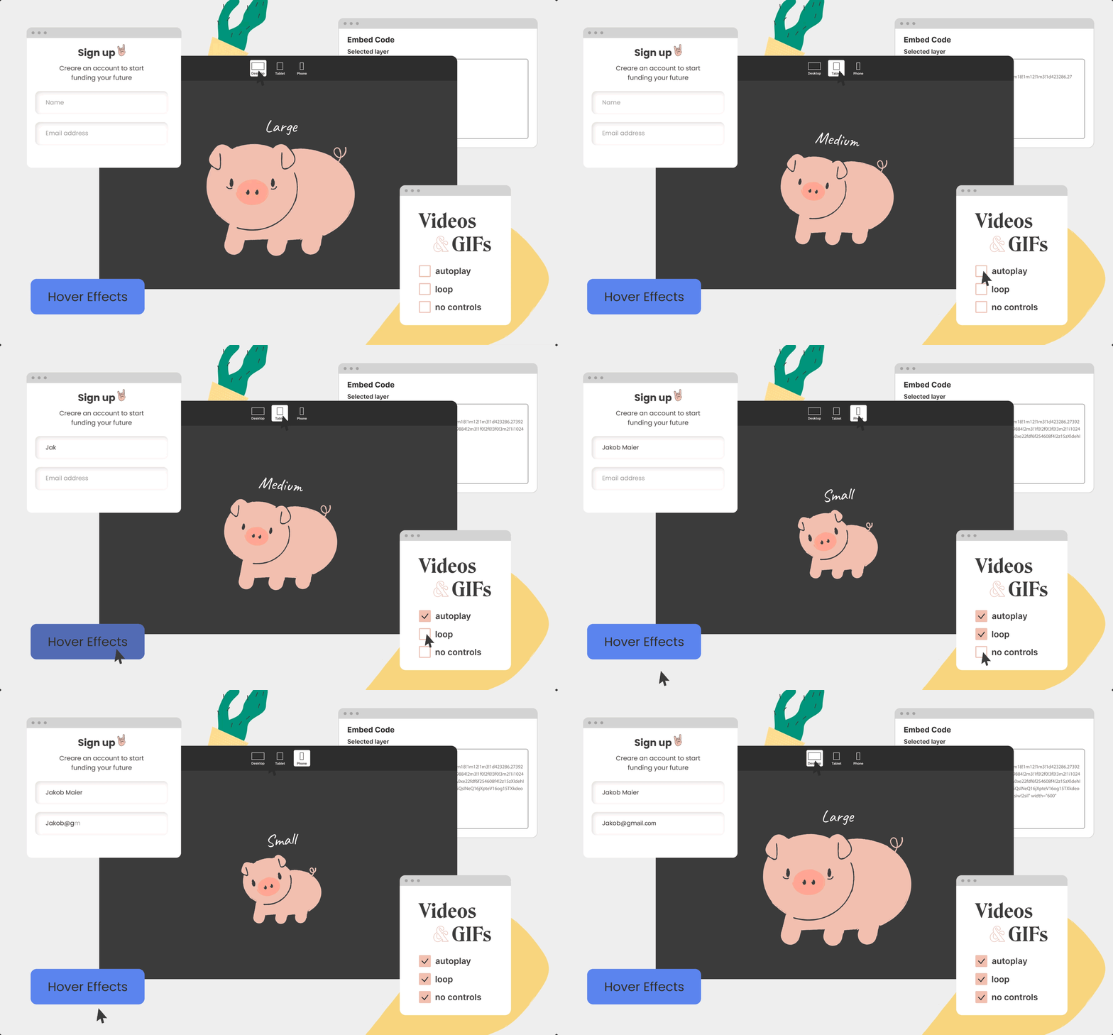
3. Hover Effects in Prototypes 👆

Figma design with Hover effect by using Anima
Let’s face it, you want to impress your stakeholders. You want to add some dazzle to your design. Something a plain Figma prototype just can’t do.
A small hover effect can go a long way. It makes your design come alive. It’s no longer a static image.
With Anima, you can add Hover effects to your prototypes.

Hover effects in an Anima prototype made with Figma and Anima
Learn more about Hover effects.
4. Live Videos in Prototypes 📺

Figma file with live video, by using Anima

A live video playing in Anima prototype made with Figma and Anima
Adding a video to your prototypes is one of the most popular features Anima has.
You can add a video for product demonstrations, moving backgrounds, and all sorts of use-cases.
You can use YouTube, Vimeo, MP4, GIFs, and even Lottie.
Learn more about Videos.
5. Share HTML/CSS/React for your Prototype ⚛️
Prototypes are usually just one step in the process of product development.
At some point when the design and UX are agreed upon, developers need to code the design into a real product.
The good news is that with Anima developers don’t have to start from scratch.
Anima provides a convenient way for developers to get the code for your design.
 With Anima, you can share code with developers to speed up your team workflow.
So there you have it. Anima provides you the additional oomph you need to blow your colleagues’ minds.
Try it, you won’t regret it!
As always, we’re excited to hear your feedback!
Join the discussion or show off your designs on Facebook, Twitter, Slack, Instagram. Vote for new features at UserVoice.
Stay creative!
❤️ Anima team


 Figma
Figma Adobe XD
 Sketch
 Blog
Blog


